
GoldNuggets — Oil vs Gold and More
GoldNuggets Digest: oil vs gold ratio, oil and gold vs other commodities, silver price technicals, platinum market update, commodity capex crowd-out...

The GoldNuggets Digest is our free publication. It contains "nuggets" of Charts & Research that come across our desk on gold and investing which we think will be interesting and useful for investors.
Please feel welcome to share this with friends and colleagues! :-)
Oil vs Gold
Stepping back from the extreme volatility in oil prices today (down almost 10% at the time of writing, following so far only limited response by Iran to the weekend US bombing run on Iran’s nuclear facilities) — the bigger picture here is that oil has reached what appears to be a low point vs the gold price. (source)
In all my experience in markets and all the charts I’ve studied, I can say one thing with confidence: pay close attention when you see extremes like this (particularly when they start to turn).

Oil & Gold vs Other Commodities
Here’s another angle on it, but breaking it out into Crude Oil vs other commodities (equal-weighted) and the same for gold. (source)
This way of looking at it is insightful because it shows how the extreme level in the chart above has arisen due to both legs (i.e. crude oil making major relative lows vs other commodities, and gold making major relative highs — and both seeing initial exhaustion of both moves).
If I had to bet one way or the other I’d be betting on oil vs gold just given how stretched the rubber band is at this point.

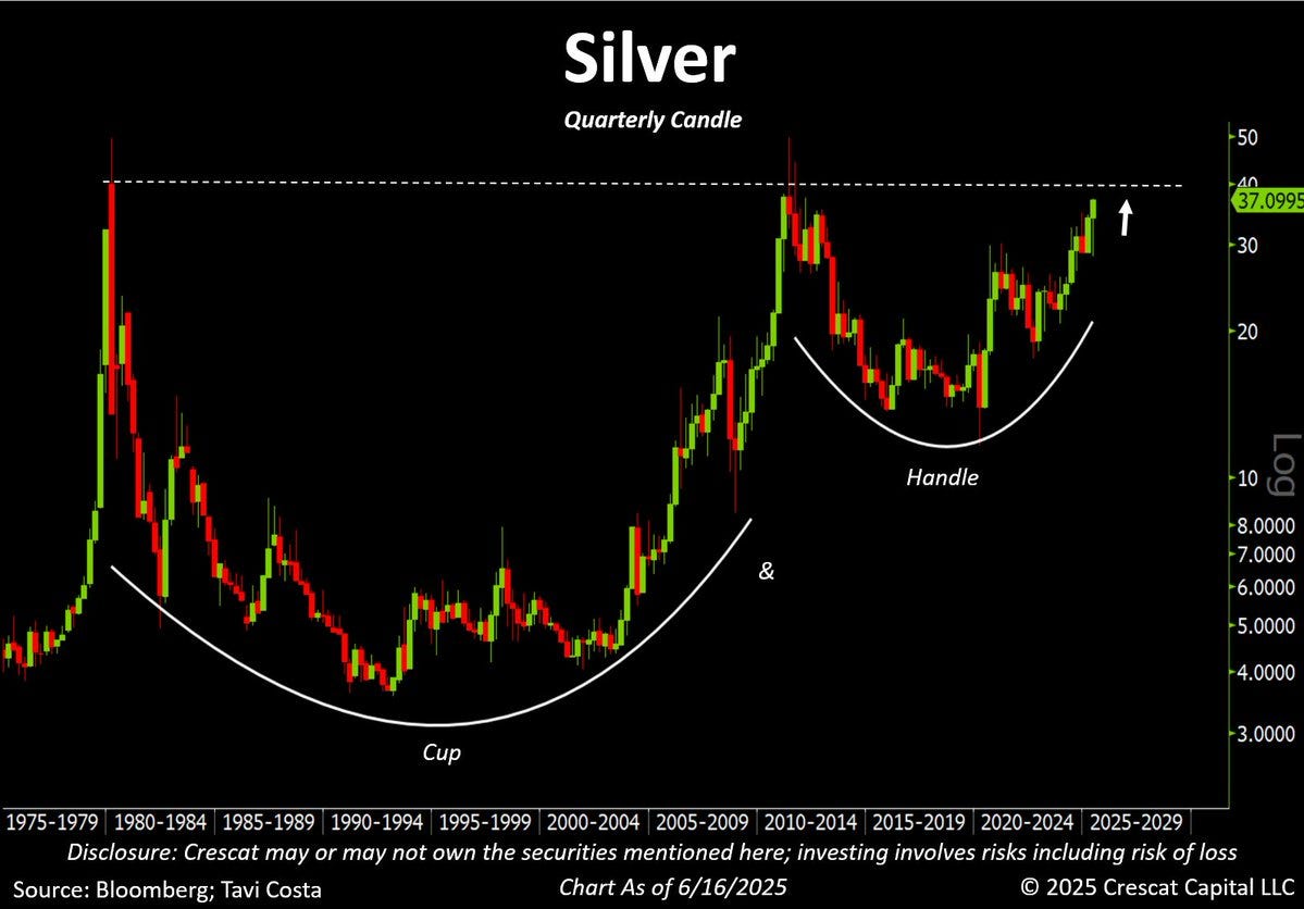
Silver Lines
Elsewhere, Tavi Costa of Crescat Capital comments “Silver is on the verge of a major breakout, in my view, from one of the longest cup-and-handle formations I’ve ever seen.“ (source)
Big if true, watch this space…
Platinum Punching Higher
The breakout in platinum prices has proven explosive so far, it just goes to show that when you get a breakout from a large technical pattern like this it can go fast and far. How far it goes from here is anyone’s guess. (source)

Commodity Capex Crowd-out
I mused the other day on Twitter/X: “Tech stocks are taking up a growing share of corporate capex spend ---but are we investing enough in real world supplies/materials to fuel and build our future? And for that matter, if we're underinvesting in commodities, maybe commodities are actually the place to be...“ (source)
Yet another clue for commodity super-cycle seekers.

This note was brought to you by the Monthly Gold Market Chartbook
About the Monthly Gold Market Chartbook
The monthly Gold Market Chartbook is specifically designed to help busy investors quickly + easily understand the key drivers of risk vs opportunity in the gold market (and how it fits into traditional portfolios).
The pack includes over 60 charts, specialized indicators, and unique data, spanning:
Sentiment/Flows/Positioning (where are the pressures building up?)
Technicals, Global Gold Price (momentum, trend, divergences)
Long-term & Valuation Indicators (is gold overvalued?)
Gold Influences: Monetary & Macro (monetary tailwinds in play)
Gold Influences: Supply & Demand (supply vs demand outlook)
Gold Priced in other Currencies (what’s gold doing elsewhere?)
Gold Price Ratios (how is gold performing vs other assets?)
Asset Allocation Perspectives on Gold (how does gold fit in portfolios?)
Asset Watch: Stocks/Bonds/USD/Credit (risks vs opportunities in other major asset classes — and how that compares vs gold)
NEW: Silver Charts Section: sentiment, positioning, flows, valuations (i.e. how is the outlook for silver prices?)
Act Now — Activate a 7-day Trial Pass to get instant access to the latest chartbook + archives and see if it’s right for you and something you’d like to support:
If you have any questions/suggestions about the material or requests, simply get in touch via the website, we’d love to hear your thoughts.
Best wishes,
Callum Thomas
Head of Research & Founder
Topdown Charts | www.topdowncharts.com
LinkedIn: https://www.linkedin.com/in/callum-thomas-4990063/
NEW: Other services by Topdown Charts
Topdown Charts Entry-Level — [TD entry-level service]
Topdown Charts Professional — [institutional service]
Weekly S&P 500 ChartStorm —[US Equities in focus]
Monthly Gold Market Pack — [Gold charts]
Australian Market Valuation Book —[Aussie markets]
Great charts Callum. I hear what you are saying on the oil vs. gold chart, but I'm just not sure that the data generating process underlying it is stable. Gold is supported by a long-term lack of investment in exploration and development, leading to minimal long-term supply growth amid exploding demand arising from monetary instability/debt-deficits.
While oil faces significant headwinds as the conversion of the global automobile fleet from ICE to BEV/Hybrid continues apace. The fact that we couldn't hold $80/bbl even with Iran lobbing missiles into Qatar, threatening the Straits of Hormuz and US striking Iran is deeply bearish, IMHO.
Gold, meanwhile is treading water despite a surge in US equities/fall in the VIX index, which normally would have seen a 'healthy' correction.
Right now, I am 6/10 bullish gold, but 8-9/10 bullish platinum and silver. If you are right on the industrial cycle turning up, platinum and silver are going to run.
Do you think this trend is sustainable, or are we on the brink of a convergence?