GoldNuggets — Valuations in Focus
GoldNuggets Digest: a detailed look at our gold valuation indicators, approach + methodology, and key underlying concepts...
The GoldNuggets Digest is our weekly publication. It contains "nuggets" of Charts & Research (on gold, precious metals, and macro) which we think will be interesting and useful for investors.
>>> Valuations in Focus: this week I’m going to provide some insight into how the gold market valuation indicators work — because the conventional wisdom is that it’s hard/impossible to put a value on gold + I’ve had a few questions about it recently, so I will explain! :-)
The Composite Valuation Indicator
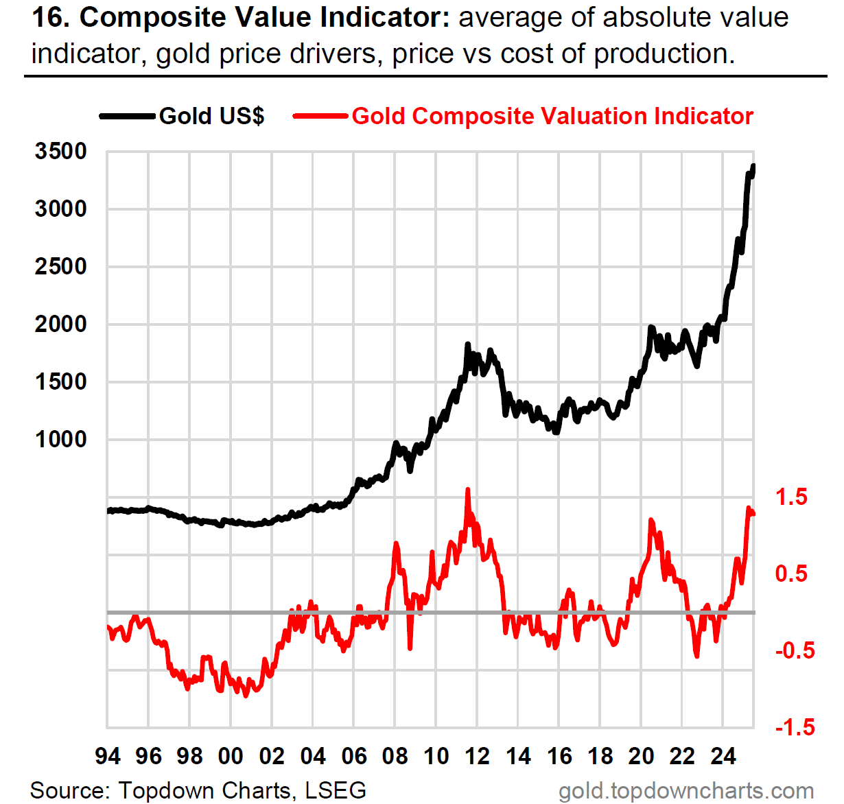
First up is the big beast itself: our Composite Gold Market Valuation Indicator. It splices together 3 key approaches (shown in the next chart), and those approaches collectively bring in information from dozens of different individual data series and sources. (source)
The key point is that it is fit for purpose (i.e. it helps us navigate market cycles by signaling that the market is expensive around market peaks and cheap around market troughs) and it lines up with the 3 key principles of valuation indicator design (as explained below in the 4th chart).
As to the current signal, it is telling us the market is expensive, and therefore we should have a greater emphasis on risk management — but as explained in chart 5, we don’t stop there (and it’s only part of the picture).
The Components
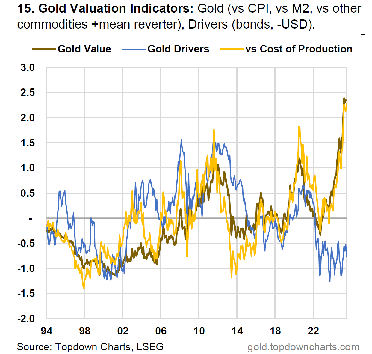
This next chart from the monthly pack lays out the 3 key approaches, which are explained in detail below. (source)
Gold Value Proxies — this is an absolute value indicator, it combines the equal-weighted z-score of the following: real gold price (deflated by US CPI), money supply adjusted gold price (deflated by US M2 money supply), detrended relative price ratio (vs all other commodities), and a 3-year nominal price mean reversion factor.
vs Cost of Production — this one tracks the gold price relative to the estimated industry-wide average cost of production (the logic being that a very high price vs cost of production represents abnormal profits and will incentivize further exploration, increased production, and increased recycling supply —with the reverse being true for times of low gold price vs cost of production).
Gold Drivers — this one is almost more of a relative value indicator in that it tracks the valuations of intermarket gold drivers (the US dollar and real yields); it’s an equal-weighted average of the Topdown Charts valuation scores for US treasuries and US dollar (USD inverted; because the logic is a stronger/weaker dollar is all-else-equal associated with a weaker/stronger US$ gold price respectively).
These 3 components are all individually calculated as an all-time z-score [ =(latest-average(all))/stdev(all) ] so as to put them on a common/comparable basis, and each indicator is given an equal “vote“ (i.e. an equal-weighted average) for the composite valuation indicator.
Wait, But Why?
Before we look at indicator design concepts, let’s start with why we even look at valuation indicators AND what we mean specifically. (source)
First though, let’s clarify definition and meaning: when I say valuation indicator here I specifically mean a time series that indicates expensive valuations for the market in question at or near the peak of past market cycles, and indicates cheap valuations at or near past market troughs.
What I don’t mean is a DCF valuation that a stock analyst might use, or a present value calculation for bond interest coupons, or a cap rate or comparable transactions snapshot that a real estate valuation might use. I’m not sure if you can come up with something like that for gold, but I have well developed expertise and experience in designing valuation indicators that can reliably and logically tell us when we are near market tops and bottoms — and we use those specifically for market cycle analysis.
The reason we study market cycles is to help capture upside opportunities and try reduce exposure to downside risk. From an asset allocation standpoint it’s about coming up with sound rationale for dynamically adjusting portfolio allocations to improve portfolio returns and reduce volatility and ideally reduce the risk/magnitude of negative portfolio returns. I’m sure some of you will have a different reason for wanting insight into market cycles for gold (e.g. hedging, treasury, planning, etc), but that’s the perspective I bring to it.
Valuation Indicator Concepts
This part helps answer why I used the inputs that I have, and what we want from a valuation indicator. (source)
A good valuation indicator ideally needs to be explainable (i.e. can you easily explain why it works, why you selected that data series and information source —i.e. the economic logic behind it).
But perhaps more importantly, from a pragmatic standpoint it needs to be sensible and reliable… it needs to give you the right signal (e.g. expensive at a market peak, cheap at a market trough), and do that consistently across time.
Ultimately if it doesn’t do what it’s supposed to then it doesn’t matter if you can explain it or what the logic is —but by the same token you don’t want to just be doing data-mining, there should be logic and clear intuition behind it even if it works perfectly (otherwise it might stop working one day and you won’t know why it should have worked in the first place).
The Bigger Picture
Last but not least, I always say that valuations should be one of the first things you look at, but certainly not the last thing. (source)
The below table gives a high level overview of how I approach market analysis and it can be applied to just about every asset class and market.
The core concept is you are trying to build a puzzle, so you want to get your hands on multiple puzzle pieces to raise the odds of you figuring out what the picture is.
Practically what this means is in the example of gold, the starting point may be that we have an expensive valuation signal, but then that’s not enough — if there is strong price momentum and monetary tailwinds: that might offset or outweigh the expensive valuation signal. But if monetary tailwinds begin to fade and technicals break down, sentiment rolls over from consensus bullish, flows turn from crowding in to crowding out, and the larger macro narrative begins to shift, then the cycle could well turn from bull to bear market… and in the end, prior to all of that, we got advance warning from the valuation signals.
So ultimately I think valuations are a key piece of the puzzle and the valuation indicator I have put together for the Monthly Gold Market Chartbook does a great job of helping us navigate long-term cycles in the gold price.
About the Monthly Gold Market Chartbook
The monthly Gold Market Chartbook is specifically designed to help busy investors quickly + easily understand the key drivers of risk vs opportunity in the gold market (and how it fits into traditional portfolios).
The pack includes over 70 charts, specialized indicators, and unique data, spanning:
Sentiment/Flows/Positioning (where are the pressures building up?)
Technicals, Global Gold Price (momentum, trend, divergences)
Long-term & Valuation Indicators (is gold overvalued?)
Gold Influences: Monetary & Macro (monetary tailwinds in play)
Gold Influences: Supply & Demand (supply vs demand outlook)
Gold Priced in other Currencies (what’s gold doing elsewhere?)
Gold Price Ratios (how is gold performing vs other assets?)
Asset Allocation Perspectives on Gold (how does gold fit in portfolios?)
Asset Watch: Stocks/Bonds/USD/Credit (risks vs opportunities in other major asset classes — and how that compares vs gold)
Silver Charts Section: sentiment, positioning, flows, valuations (i.e. how is the outlook for silver prices?)
NEW: Gold Miners: valuations, flows, allocations, fundamentals (i.e. what’s the risk/return setup for Gold Mining stocks?)
NEW: Other Precious Metals (Platinum & Palladium charts)
Subscribe Now — if you haven’t already subscribed (e.g. if you were forwarded this email) be sure to sign up using the button below.
If you have any questions/suggestions about the material or requests, simply get in touch via the website, we’d love to hear your thoughts.
Best wishes,
Callum Thomas
Head of Research & Founder
Topdown Charts | www.topdowncharts.com
LinkedIn: https://www.linkedin.com/in/callum-thomas-4990063/
NEW: Other services by Topdown Charts
Topdown Charts Entry-Level — [TD entry-level service]
Topdown Charts Professional — [institutional service]
Weekly S&P 500 ChartStorm —[US Equities in focus]
Monthly Gold Market Pack — [Gold charts]
Australian Market Valuation Book —[Aussie markets]


A good explanation. I've believed for a long time that precious metals and especially gold are a key component in a well diversified portfolio. I'm surprised by how so many investors, even professional financial advisors ignore it. The tricky part is combining both value and momentum perspectives to get the right balance between future risk and reward.
Is the Gold Drivers component like gold/bond price correlation?