


GoldNuggets — Trends, Gold, Stocks
GoldNuggets Digest: the trend is your friend, gold gains ground, relative performance trends and tactics, global FX reserves diversification breakdown...

The GoldNuggets Digest is our free publication — it contains "nuggets" of Charts & Research that come across our desk on gold, precious metals, miners, and macro which we think might be interesting and useful for investors.
Please feel welcome to share this with friends and colleagues :-)
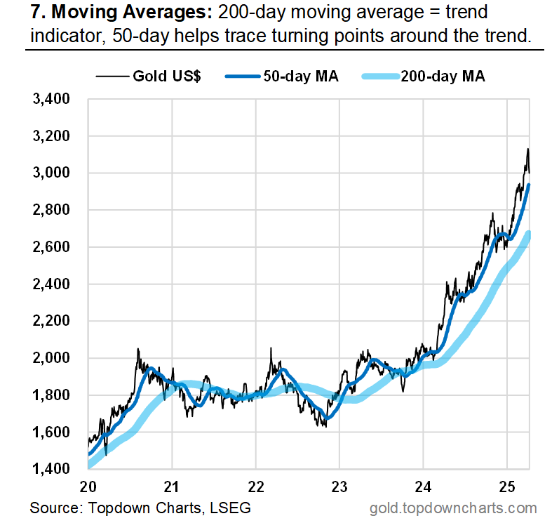
The Trend is Your Friend
Here’s an update to Chart no.7 from the monthly pack —while gold has pulled back from the highs, the trend remains well intact (which is more than I can say about the stockmarket, which has seen a trend change). (source)
Gold paradoxically often sees bouts of weakness during crashes and crises because folk tend to sell the stronger parts of their portfolios to raise cash and/or rebalance. We have seen some of that happening, but it’s also worth highlighting that although gold is down in absolute terms, its relative performance has been decent…
Gold Gains Ground
Indeed, the gold vs stocks ratio has clearly turned the corner —finally following the lead set by the gold vs cash and gold vs treasuries ratio.
If recession takes hold and the stockmarket stays in bear market mode, it’s likely that we’ll see further follow-through in the black line.
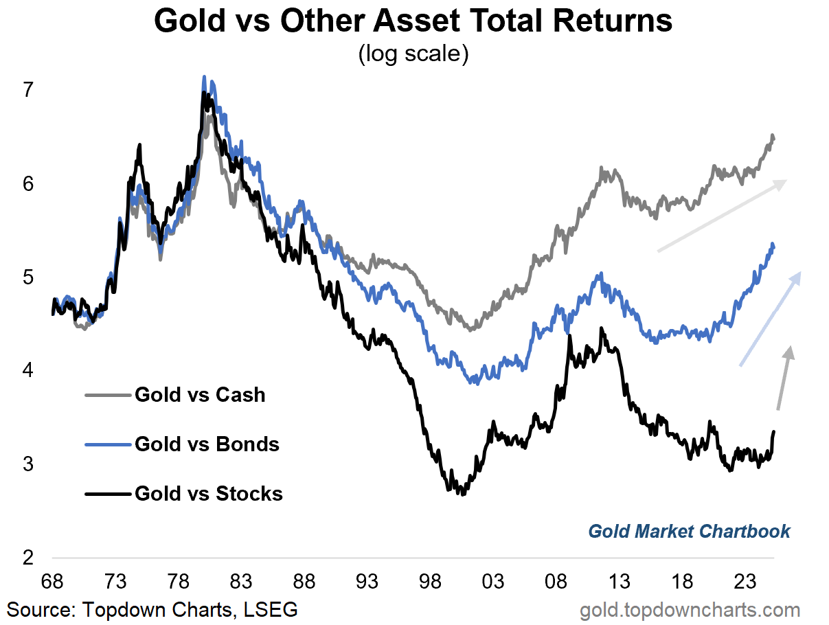
Gold vs Stocks Gap
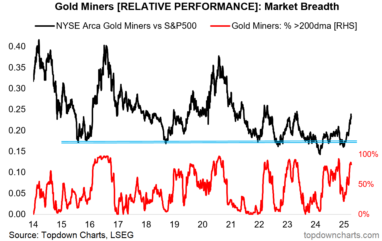
Even miners are starting to slowly play catch-up (however the gold miners vs S&P500 ratio is still lagging far behind vs the gold/stocks ratio).
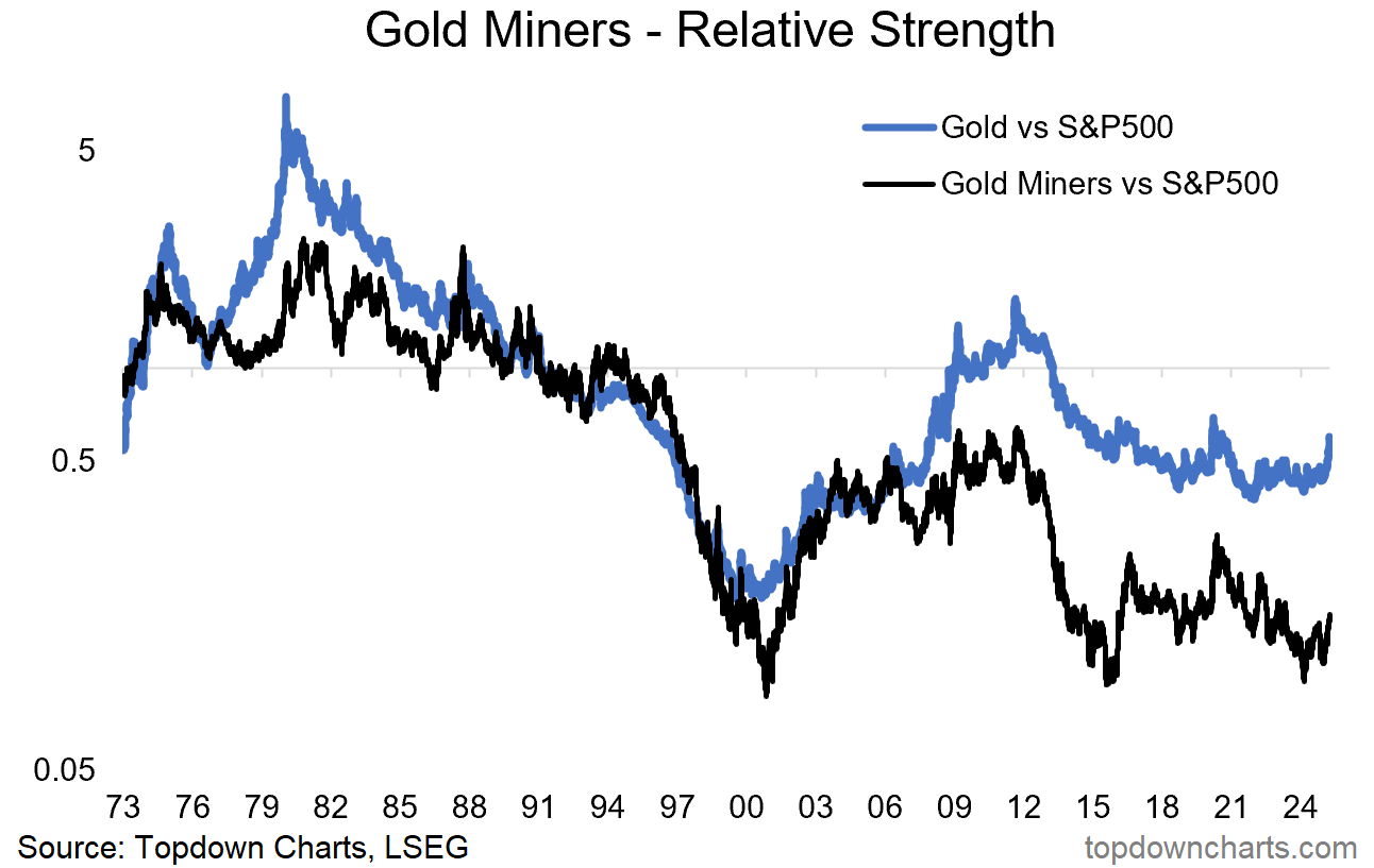
Gold Miners vs the Market
Gold miners’ relative performance has turned out very much akin to defensives (healthcare, staples, utilities) over the past couple of weeks.
The relative performance of miners has in recent years reliably moved higher during market downturns and corrections.
Gold miners’ relative performance vs stocks is as much dependent on gold price strength as it is stockmarket weakness.
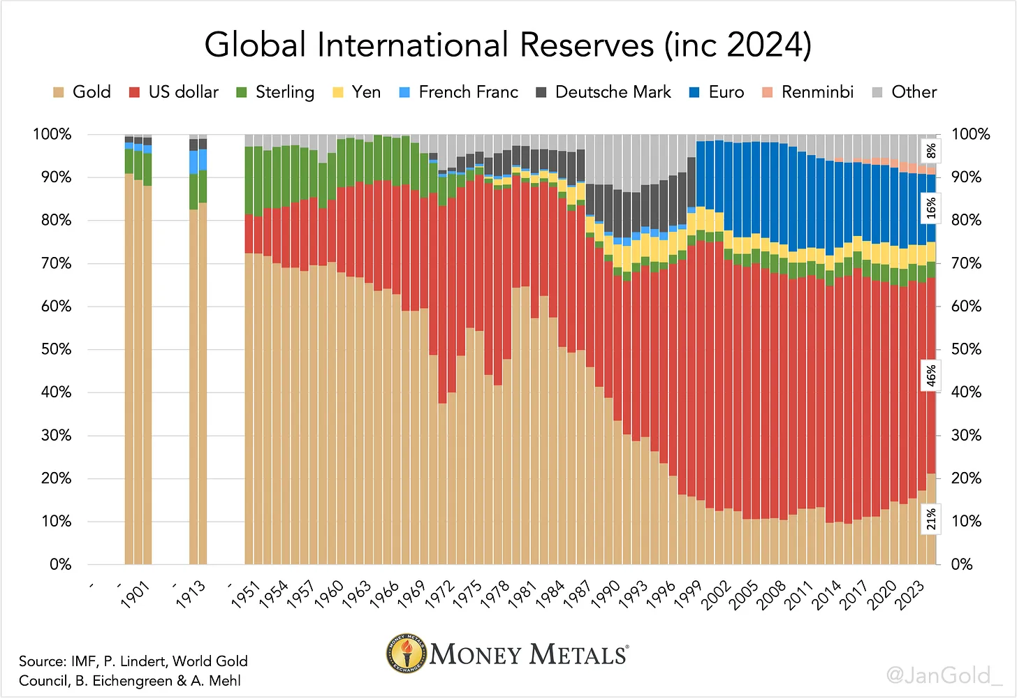
Global FX Reserves Diversification
- estimates that “gold’s percentage of global international reserves jumped up 4%, to 21%, in 2024. That’s the biggest surge in more than four decades.“ (source)
This is an interesting chart for 2 reasons, first it goes to show how much allocations to gold have gone up, but also the changing composition across FX reserves — including a shrinking of total allocations to US Dollar assets.
I suspect the allocation to USD may only drop further from here as reserve managers the world over look to rotate out of risky USD assets!
Log on to the website for more updates: gold.topdowncharts.com
ICYMI: Previous edition GoldNuggets — Gold, Silver, Oil, Houses
GoldNuggets — Gold, Silver, Oil, Houses

The GoldNuggets Digest is our free publication — it contains "nuggets" of Charts & Research that come across our desk on gold, precious metals, miners, and macro which we think might be interesting and useful for investors.
Not a Subscriber yet? Learn more about the Monthly Gold Market Chartbook + Subscribe for updates (and upgrade to access the full monthly pack).