
GoldNuggets — Gold ETF Observations
GoldNuggets Digest: total assets in Gold ETFs, gold ETF allocations, gold ETF holdings of gold, gold miners vs energy stock ETF allocations, the coming commodity bull market...

The GoldNuggets Digest is our weekly publication. It contains "nuggets" of Charts & Research on gold, commodities, and macro —issues and insights which we think will be interesting and useful for investors.
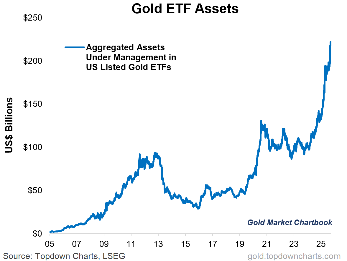
Gold ETF AUM
As gold pushes on to fresh new highs, so too does the aggregated Assets Under Management figure for US listed gold ETFs.
But this is only part of the picture… (price is doing a lot of heavy lifting).
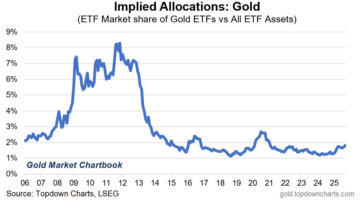
Gold ETF Allocations
For example, when compared to all other ETFs, gold ETF “implied allocations“ have only just made new multi-year highs… but remain well below long-term average (and previous highs).
If there’s a bubble in gold, it isn’t on display here.
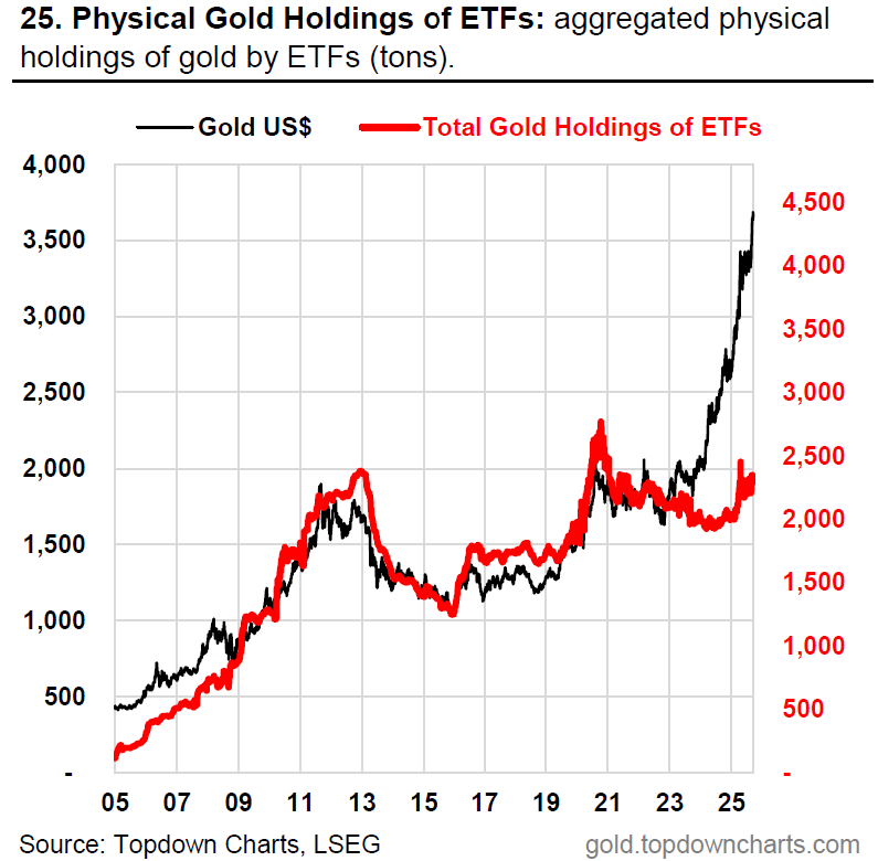
Gold ETF Holdings of Gold
Another interesting aspect, which tracks with the tepid allocations (and for reference; flows have also been lukewarm), is that collectively gold ETFs hold *less* tons of gold now than during the local peak back in 2020. (source)
Curiously, this indicator has *not* confirmed the new highs in gold, and actually peaked back in April.
There’s a lot of things driving the current gold bull market, but speculative retail participation via ETFs is not really a key driver by the looks of things here.
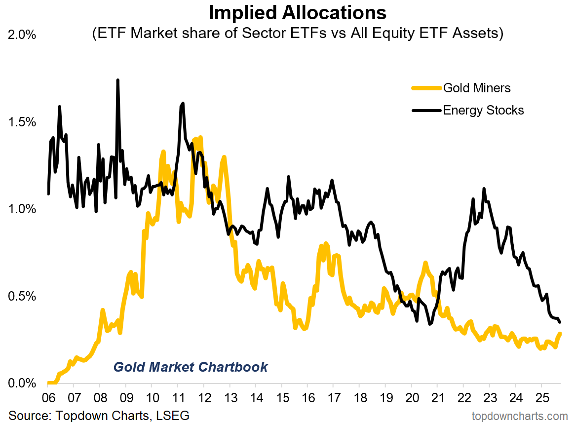
Gold Miners vs Energy ETF Allocations
Another interesting one on the “implied allocations“ front: even after a more than 100% gain YTD, gold mining stock ETF allocations are barely up off the lows and pale in comparison to previous peaks.
That may well mean room to run for miners.
The other interesting aspect is how there is equally relatively little enthusiasm for Energy (oil & gas) ETFs — I think this goes to show how underexposed investors are in general to a prospective new bull market in commodities in general.
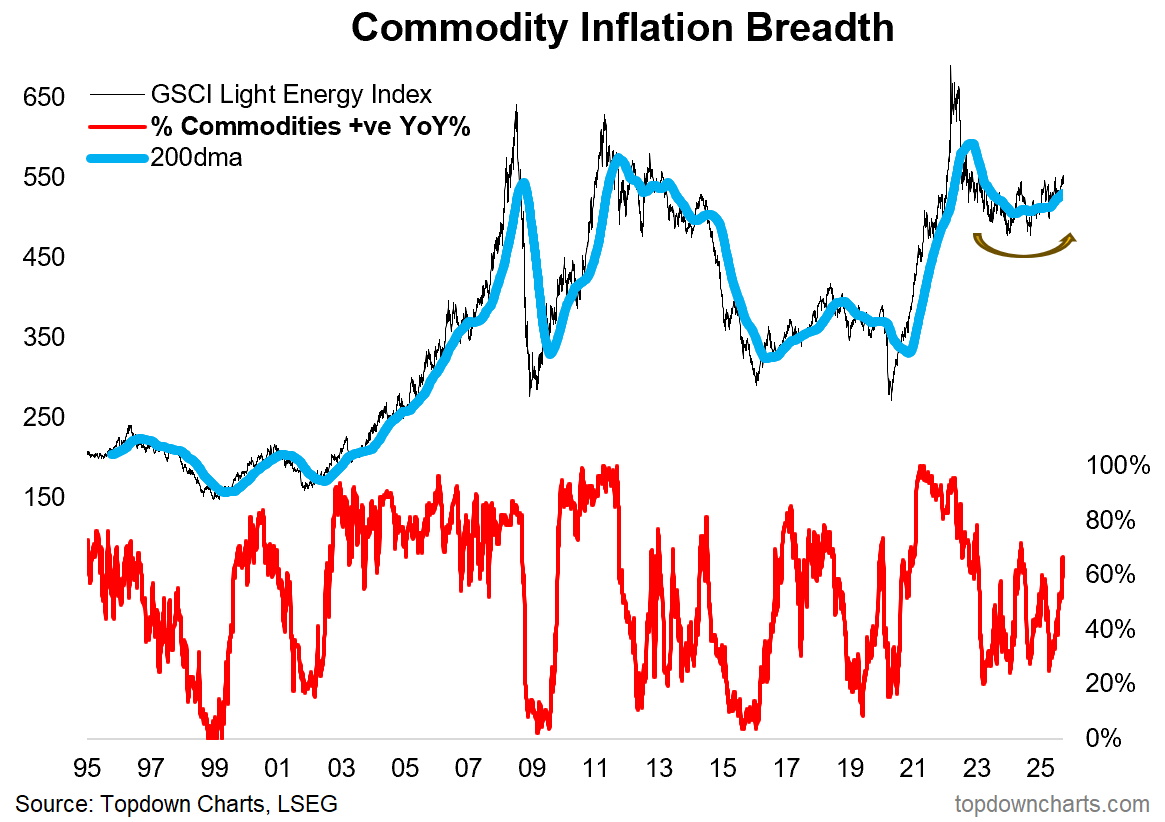
Commodity Bull Market — Coming Soon…?
Speaking of which, I don’t think people understand just what’s going on in commodities right now (and the implications for inflation).
Commodities as a group have been undergoing a multi-year bottoming process, and the logical next step from a technical (and macro) standpoint is a new cyclical bull market.
As I’ve previously outlined, I believe the strong run in gold is a key harbinger here; expect inflation to be a key theme in 2026.
This note was brought to you by the Monthly Gold Market Chartbook
SURVEY: Out of curiosity (since it’s topical this week), if you invest in gold — how do you primarily obtain exposure (i.e. as your main/largest position in gold)?
About the Monthly Gold Market Chartbook
The monthly Gold Market Chartbook is specifically designed to help busy investors quickly + easily understand the key drivers of risk vs opportunity in the gold market (and how it fits into traditional portfolios).
The pack includes over 70 charts, specialized indicators, and unique data, spanning:
Sentiment/Flows/Positioning (where are the pressures building up?)
Technicals, Global Gold Price (momentum, trend, divergences)
Long-term & Valuation Indicators (is gold overvalued?)
Gold Influences: Monetary & Macro (monetary tailwinds in play)
Gold Influences: Supply & Demand (supply vs demand outlook)
Gold Priced in other Currencies (what’s gold doing elsewhere?)
Gold Price Ratios (how is gold performing vs other assets?)
Asset Allocation Perspectives on Gold (how does gold fit in portfolios?)
Asset Watch: Stocks/Bonds/USD/Credit (risks vs opportunities in other major asset classes — and how that compares vs gold)
Silver Charts Section: sentiment, positioning, flows, valuations (i.e. how is the outlook for silver prices?)
NEW: Gold Miners: valuations, flows, allocations, fundamentals (i.e. what’s the risk/return setup for Gold Mining stocks?)
NEW: Other Precious Metals (Platinum & Palladium charts)
Act Now — (if you’re not already a subscriber), sign up to get instant access to the latest chartbook + archives; level-up your understanding and visibility on the key risks & opportunities in gold and precious metals investing.
If you have any questions/suggestions about the material or requests, simply get in touch via the website, we’d love to hear your thoughts.
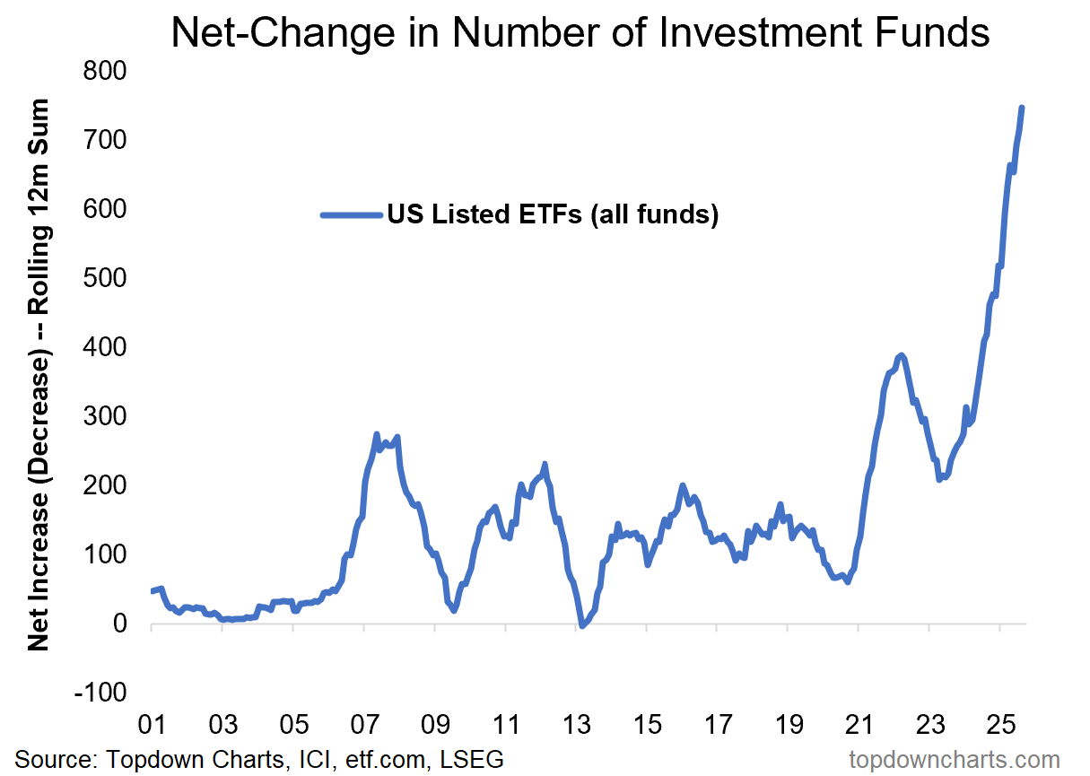
Bonus Chart — the ETF Launch Frenzy
I thought it might be interesting to share the bonus chart from the latest Weekly S&P500 ChartStorm because it also deals with the ETF market. This chart covers all the different ETFs listed in the USA and tracks the rolling 12-month net change in the number of ETFs…
The key point is it just reached a record high, and if you scan through the latest launches it’s mostly highly leveraged equity ETFs (and leveraged single stock ETFs (!)) — so I would say while this might not necessarily be a topping signal for the increasingly frothy equity market, it is certainly a sign of the times…
Best wishes,
Callum Thomas
Head of Research & Founder
Topdown Charts | www.topdowncharts.com
LinkedIn: https://www.linkedin.com/in/callum-thomas-4990063/
NEW: Other services by Topdown Charts
Topdown Charts Entry-Level — [TD entry-level service]
Topdown Charts Professional — [institutional service]
Weekly S&P 500 ChartStorm —[US Equities in focus]
Monthly Gold Market Pack — [Gold charts]
Australian Market Valuation Book —[Aussie markets]
On the gold ETF conundrum, I suggest looking at launch & inflows to new ETFs outside the US. My guess is a lot of overseas retail are allocating to new offshore product, particularly in HK.
Excellent
Compilation
Deep
Drill down