
GoldNuggets — Gold Miners & Ratios
GoldNuggets Digest: gold mining stocks' relative performance, the relative strength gap, miners vs S&P500 relative value, oil and gold vs the rest of commodities, supercycle scintillations...

The GoldNuggets Digest is our weekly publication. It contains “nuggets” of Charts & Research on gold, commodities, and macro —issues and insights which we think will be interesting and useful for investors.
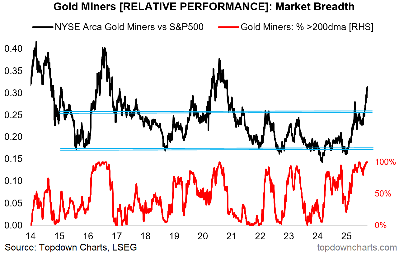
Gold Miners vs S&P500
This chart will probably be no surprise to regular readers given GDX (gold miners ETF) is up +111% YTD vs S&P500 +13% — but from a technical standpoint this is a fantastic chart.
The relative performance line has broken out through a major resistance line (after an initial failed breakout), and relative performance breadth is running strong. But I think many are sitting there on the sidelines and thinking “how much further can gold miners go?”
Gold/Miners Relative Strength Gap
Here’s one perspective — this chart shows (log scale) the relative performance of gold vs the S&P500 and gold miners vs the S&P500.
You can see a large gap opening up as gold miners failed to keep up during the later stages of the 2000’s gold bull market. But this gap is starting to close, and one answer to that question above is that they may well still have quite a bit of room to run if this gap is to be closed.

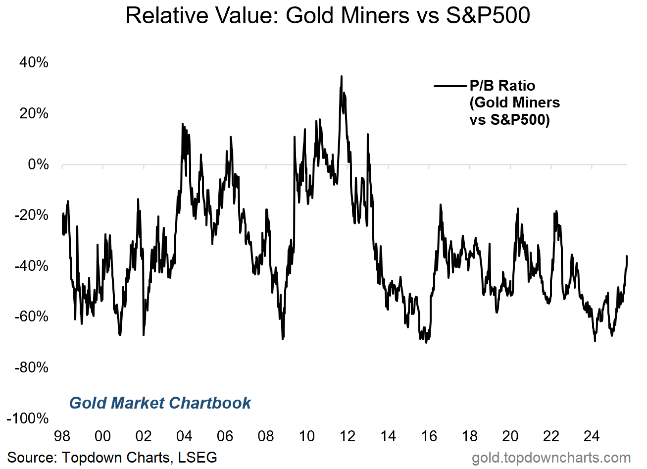
Gold Miners Relative Value
Another angle is simply looking at relative value — gold miners, despite their strong gains relative to the S&P500, are still trading at a 30% discount on a price-to-book ratio basis.
There’s 2 potential answers for how much further they can go on this chart; 1 is that they go to the upper end of the range which seems to be about a 20% discount (still some room), and 2 is that they go all the way to trading at a premium and match the previous peak (lots of room).
Either way there is room to run.
One final point I would note though in passing is that we can see ongoing outperformance of gold miners vs the S&P500 through either or a combination of the same situation (virtuous/good) of both rising but miners rising more… or through the less great way of both falling but miners falling less (or still gaining/simply holding ground vs falling S&P500). And I think that second point is worth musing upon given some of the extremes we are seeing in the US stockmarket lately.
Relative Performance (Gold & Oil)
Moving on, I find this one very interesting given the developing extremes on display — it shows the relative price ratio of oil vs all other commodities (black line) and gold vs all other commodities (gold line).
Gold is getting close to making new relative highs, and oil is getting close to making new relative lows. My inner contrarian can’t help but think about this chart looking like a rubber band stretching… where at some point it snaps back and gold corrects, crude oil soars.
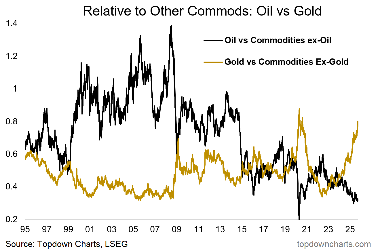
Follow the Leader
But I think the other key point, and the more interesting angle, is that it’s simply getting closer and closer to commodities’ time to join the stage.
As I noted last week, I believe a big breakout is coming in commodities, and if/when it comes we will look back on this chart and see that gold was shouting and screaming at us to take notice…
This note was brought to you by the Monthly Gold Market Chartbook
SURVEY: Following on from the last 2 charts, what do you reckon has the most upside over the next 12-months? Will gold extend its run? Will crude oil surprise? Will the “Commodity Supercycle“ come back into the lexicon? (…or something else?)
About the Monthly Gold Market Chartbook
The monthly Gold Market Chartbook is specifically designed to help busy investors quickly + easily understand the key drivers of risk vs opportunity in the gold market (and how it fits into traditional portfolios).
The pack includes over 70 charts, specialized indicators, and unique data, spanning:
Sentiment/Flows/Positioning (where are the pressures building up?)
Technicals, Global Gold Price (momentum, trend, divergences)
Long-term & Valuation Indicators (is gold overvalued?)
Gold Influences: Monetary & Macro (monetary tailwinds in play)
Gold Influences: Supply & Demand (supply vs demand outlook)
Gold Priced in other Currencies (what’s gold doing elsewhere?)
Gold Price Ratios (how is gold performing vs other assets?)
Asset Allocation Perspectives on Gold (how does gold fit in portfolios?)
Asset Watch: Stocks/Bonds/USD/Credit (risks vs opportunities in other major asset classes — and how that compares vs gold)
Silver Charts Section: sentiment, positioning, flows, valuations (i.e. how is the outlook for silver prices?)
NEW: Gold Miners: valuations, flows, allocations, fundamentals (i.e. what’s the risk/return setup for Gold Mining stocks?)
NEW: Other Precious Metals (Platinum & Palladium charts)
Act Now — (if you’re not already a subscriber), sign up to get instant access to the latest chartbook + archives; level-up your understanding and visibility on the key risks & opportunities in gold and precious metals investing.
If you have any questions/suggestions about the material or requests, simply get in touch via the website, we’d love to hear your thoughts.
Best wishes,
Callum Thomas
Head of Research & Founder
Topdown Charts | www.topdowncharts.com
LinkedIn: https://www.linkedin.com/in/callum-thomas-4990063/
NEW: Other services by Topdown Charts
Topdown Charts Entry-Level — [TD entry-level service]
Topdown Charts Professional — [institutional service]
Weekly S&P 500 ChartStorm —[US Equities in focus]
Monthly Gold Market Pack — [Gold charts]
Australian Market Valuation Book —[Aussie markets]
Excellent perspective and analysis as always, Callum.
Despite being a huge gold bull, I voted for "something else": Uranium/generally Nuclear energy tech. You should track those at least as closely as Gold, and at least since 2020. Incidentally, in the short term (6-12 months) crude may have a big spike as Russian oil machine is coming to rather crashing halt. Given anti-correlation in the nice chart of long-term Gold/Crude you show, that MIGHT mean a pause in Gold, despite it having everything going its way. But heck, with the worldwide mess of uncertainty, they might melt-up together! I'm holding both.